Delivering Brand Experience through Software UI
To really build meaningful relationships with customers, and create a brand experience that is in itself a reason to engage (above and beyond the product or service they are providing), a company's values need to permeate through the entire experience, in all customer touchpoints, from the first introduction to ongoing use of products in the home.
In addition to marketing and product hardware, software -- and product UI -- is key to delivering this complete and distinct brand experience. A branded UI design language not only reinforces the brand personality, voice, and appearance, but also establishes a relationship with the company that customers can depend on; it enables them to transfer knowledge of one UI to another, thereby delivering on expectations and a great experience that will keep them coming back.
•••
For Logitech, I worked with Smart Design to create a branded UI language that could be universally applied across a number of product groups. With a considered software experience across its product ecosystem, Logitech could deliver something more to customers than the value of each, singular product. People would choose Logitech for the experience of interacting with it; an experience that is familiar from one product (and UI) to the next.
The challenge was in creating a unified experience that would work for both task-based interactions (like customizing a mouse in an office setting) to more activity-based interactions (like gaming in a dark room). We wanted Logitech customers to have a familiar experience as they moved between these disparate activities...but it also needed to be an experience fit for purpose, which made the experience of whatever it was they were doing better.
We delivered a framework for assessing product/software UI needs; a set of guiding design principles; a UI design language style guide (UX patterns for major interactions and controls); and usability guidelines.
Example Screens
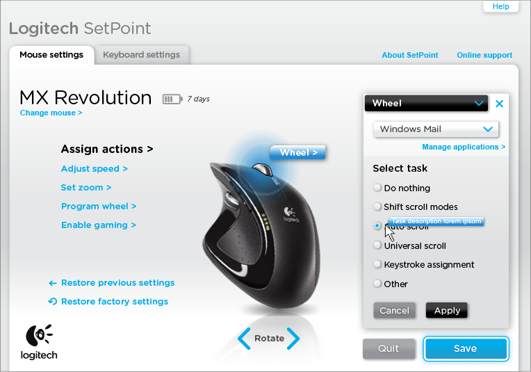
Product Customization Software

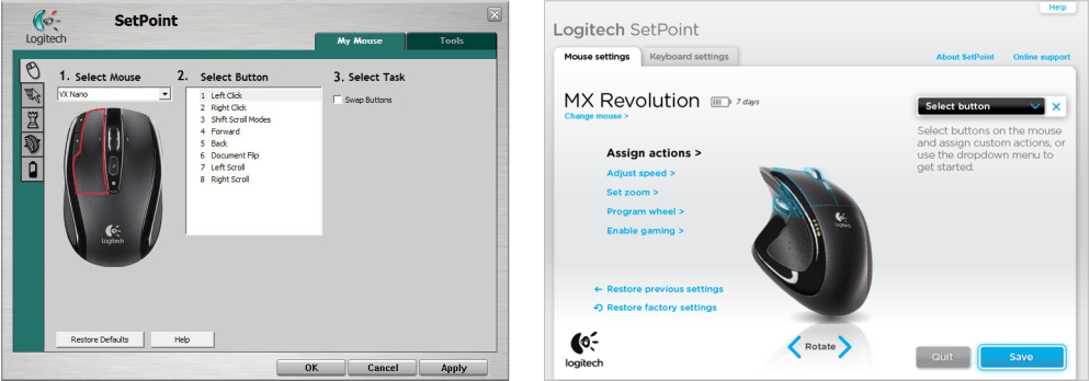
Before And After
 Music Listening Software

Before And After

Process

To get to the design recommendation, we conducted a thorough audit of key products across a broad spectrum of use cases and contexts. In this process, we identified common interaction and visual patterns, as well as the unique elements for different types of software experiences that must be retained. At this time, Logitech was going through a rebranding initiative, so we collaborated with their consultancies to understand the new brand language, and translate it to the screen and interface context. We also conducted studies of best-in-class experiences to inspire new interaction concepts (taking cues from brands like Nike, for example, for how to celebrate and customize products).
Related

 Music Listening Software


 To get to the design recommendation, we conducted a thorough audit of key products across a broad spectrum of use cases and contexts. In this process, we identified common interaction and visual patterns, as well as the unique elements for different types of software experiences that must be retained. At this time, Logitech was going through a rebranding initiative, so we collaborated with their consultancies to understand the new brand language, and translate it to the screen and interface context. We also conducted studies of best-in-class experiences to inspire new interaction concepts (taking cues from brands like Nike, for example, for how to celebrate and customize products).